Frames in the United Kingdom in the first half of the 20th century, with particular reference to The Poetry of Crisis Collection 1933-1951
by Peter Nahum

Artists’ frames relate to how much money an artist may have at any given point in time. Most artists have little and when they frame their paintings, they frame them simply. However, this does not apply to designer artists, like, for instance, those Scottish artists of the Glasgow Style of the early 20th century, especially those influenced by Charles René Mackintosh, E.A. Taylor, Jessie M. King and Frances and Herbert MacNair, who exhibited in Turin in 1902 and influenced artists all over Europe.
During the World Wars I and II, there was no gold, so even for those who might have been able to afford such luxuries, it was not possible. The first World War favoured darker and plain wood frames and Dutch 17th century style frames; the second, heavier, reused and cut-down frames decorated with house paint. Two original examples from WWII are Louis Le Brocquy, Alone. The word is life endured and known. It is the stillness where our spirits walk, 1944; and Robert McBryde, Still Life of Oranges, 1944-45. As another example, Graham Sutherland designed and made his own frames with a broad darkish wooden outer with a broad stained canvas inner. Paul Nash is the only person who seemed to be able to frame his own paintings successfully and to the period. They look simple, but the cross sections are quite complicated and a result no one else could imagine. We have an original frame, which I lent to two dealer/collectors to copy. Their framers, as framers often do, did not get the subtleties correct and obviously “knew better”. I would have had a few words to say to them. I will not work with any framer nor conservator who do not hold a conversation with me throughout the process. Too many of them “know better” than the artist and owner.
Some artists, like Georges Seurat, painted their frames very successfully and the frame becomes part of the whole artwork. Victor Pasmore considered his frames in the same light, and woe betide the owner who decided they knew better than the artist. The worst example of bourgeois framing was, for me, demonstrated at the Georges Braque exhibition in Paris at Grand Palais in 2013. I went mainly because of his huge reputation, formed by his contemporaries, and how his paintings appear when one sees them individually. The conclusion I came to is that he produced the most delicate and subtle images, which have been 90% destroyed by the dreadful heavy Louis XIV and Spanish frames placed on them by dealers, collectors and museums. Only one or two remained in their simple Maeght frames (flat and wide, painted mid-grey) which allowed the subtleties of the image to “speak”.
Framing is a very difficult art which is as easy, even with experience, to get wrong as to get right. There are no exact answers. When we put together the Poetry of Crisis collection over 25 years, we deliberately removed the “smart” and “fashionable” frames and replaced them with simple frames from the period. I became master of the “rubbish” frame. When we sold the collection, all the dealers who bought works reframed them in smart and flashy frames for their bourgeois clients. However, the success of the auction proved that the frames we had put on were successful, as the paintings were allowed to “speak” and looked original and untouched. Our aim is always to frame so that the frame allows the image to be dominant. Our framing creed is: If someone says “that is a wonderful frame” we have failed and if another says “that is a wonderful painting” we have succeeded. That does not mean that all frames should be dowdy.
When we framed the Tolkien collection, painted by Paul Gregory, we rejected the artist’s attempt to design simpler frames and placed his paintings in elaborate, Gothic frames, often decorated with hand-carved dragons and armour.

Paul Raymond Gregory, frame, Image permission and credit: Peter & Renate Nahum; Paul Raymond Gregory
The paintings were large enough and strong enough to stand up to and be enhanced by these monumental frames. One of the frames has about 50 individual carved elements.

Other rules for framing relate to compositions. Stanley Spencer, like Edvard Munch, composes his images as though looking through a window i.e. the actual composition goes on beyond the frame. Such compositions need enclosing with heavier cross-section frames to emphasise the window effect. In contrast, there are those compositions which are simple and endless, such as Victor Pasmore’s Still Sea, which need to “breath” and need a flat and simple wide frame. Then framing to the period is often very necessary, as an artist usually paints within his own period and is part of the image of the time. Thus, we are used to seeing those paintings framed as others of the period and they should be fitted into that genre. It takes an extremely talented “eye” to break the mould successfully, which, in principle, should not be attempted.
There is then the question of do we need a frame at all. Some abstract paintings stand on their own without a frame, although this does also relate to their surroundings. The Museum of Modern Art (MOMA) in New York has solved this problem very successfully, using a thin guttered frame (the gutter is often dark). They reframed their Picassos and Matisses in these frames to great effect, ditching their dreadful bourgeois Louis XIV frames and allowing their modern abstraction to speak out loud and clear. We know Manet favoured a very simple white-painted frame. There are almost none existing as buyers require frames to fit in with their decoration.
Bad framing will always exist and frames will change regularly. Everyone is responsible: Dealers, collectors, museums and now auction rooms as well; it does not matter how many times a work is “put back” to how it might have been or what best suits it. So if a work has its original frame and you decide to re-frame it, always keep the original frame (in store or in the garage or attic, for instance) and when you sell it, sell it with the original.
April 2023
P.S.
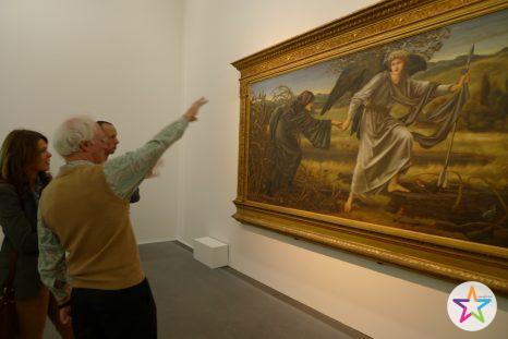
We visited many exhibits together; among them Edward Burne-Jones – Das irdische Paradies left a lasting impression, mainly due to Peter’s capability to excite his younger and older fan club for British Art of the 19th and 20th century.
The Nahum’s unique collection of British Surrealists (Poetry of Crises) – many of the paintings still being in their original frames – has been a highlight during trips to London. I wonder why it never has been exhibited „on the continent“.
Peter also has set up the The Burne-Jones Catalogue Raisonné Foundation: www.eb-j.org.
Thank you guys, Peter and Renate, for inspiring moments and for sharing your thoughts !